Add a Master-Detail View
- Copy-Paste into Your Project
- What is a Master-Detail View?
- Extending Master-Detail Layout
- Creating the Master Component
- Holding the Selection in a Signal
- Showing the Detail Reactively
- Representing Selection in the URL
This guide teaches you how to build a rudimentary master-detail view in Vaadin. It uses the Master-Detail Layout component to arrange the two areas and to handle responsive behavior, and a signal to hold the selection so the detail updates reactively. It focuses on the UI pattern only: it does not define data models, persistence, or form/grid configuration.
Copy-Paste into Your Project
If you want to quickly try out a master-detail view, you can copy-paste the following class into your Vaadin project:
Source code
MasterDetailView.java
For more detailed instructions on how to build a master-detail view from scratch, continue reading below. The guide uses the same code as in the copy-paste example, but breaks it down into smaller parts with explanations.
What is a Master-Detail View?
In a master-detail view, the user selects an item from a list (the master), and the details of the selected item are shown in another area (the detail). When no item is selected, the detail area is either hidden or shows a placeholder message.
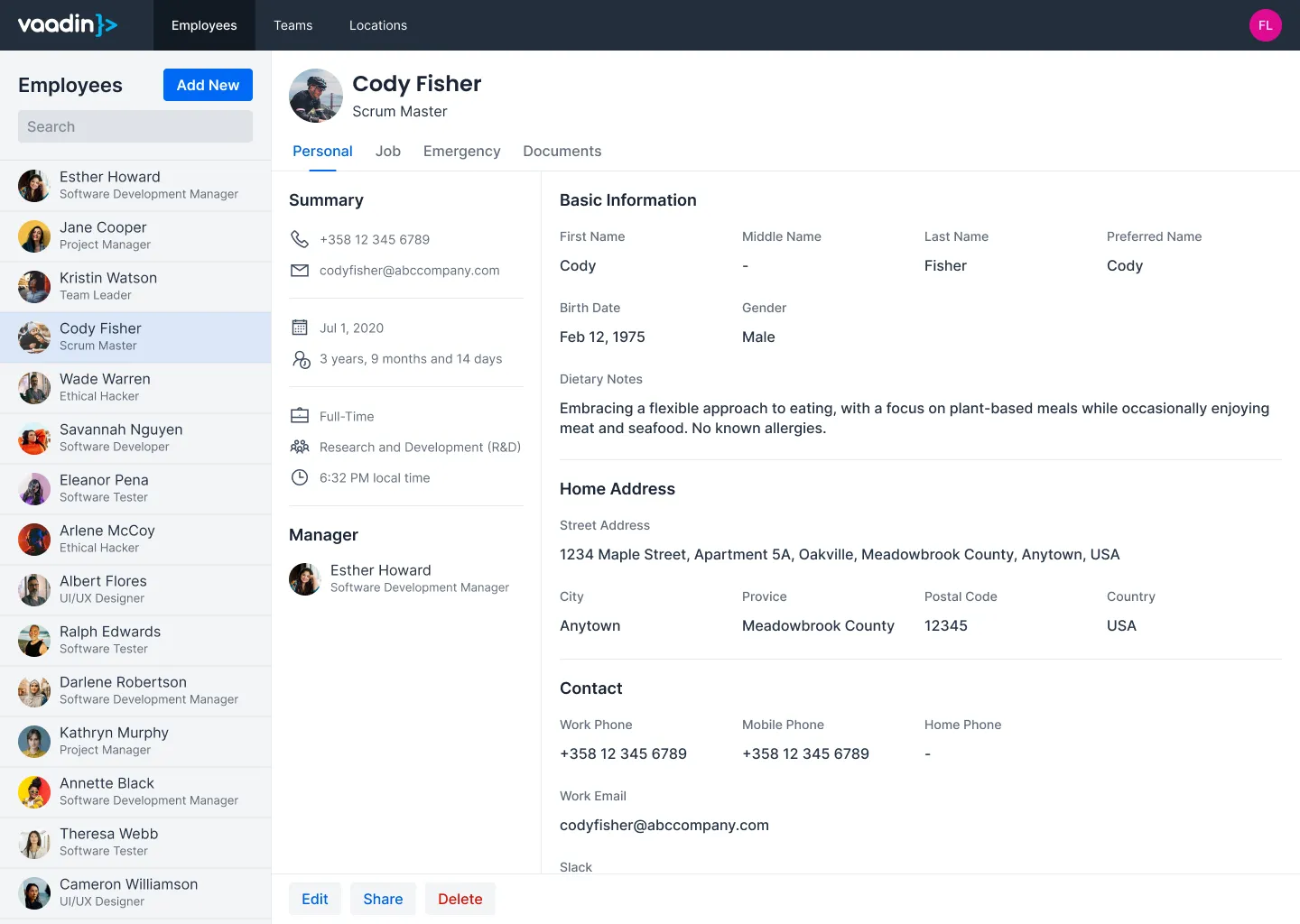
In the following mock-up, the master is a list of employees, and the detail shows information about the selected employee to the right of the list:
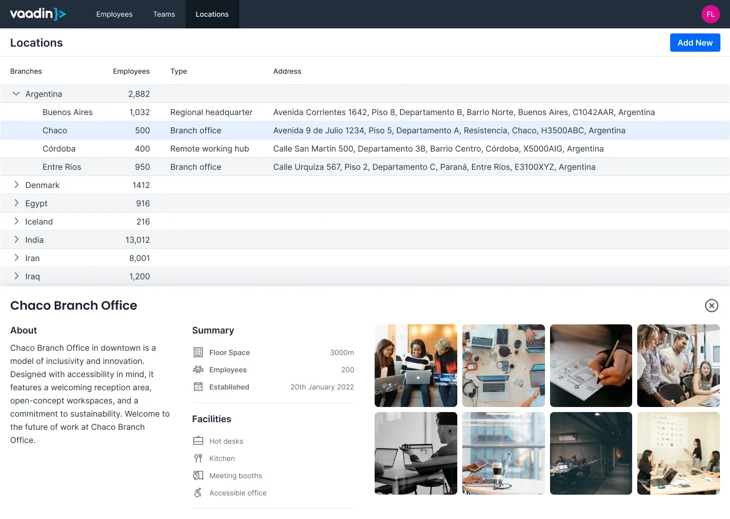
Master-detail views can look different depending on the application. In the following mock-up, the master is a list of offices, and the detail shows information about the selected office below the list:
The example code in this guide does not look like the mock-ups above. It uses simple components and focuses only on the UI pattern. Substitute your own components where indicated.
Extending Master-Detail Layout
The Master-Detail Layout component arranges the master and detail areas, and switches the detail to an overlay when there isn’t enough room to show both side by side. Because it handles this responsive behavior for you, you don’t need to manage a separate layout or decide when to hide the detail.
The view extends MasterDetailLayout directly, so the view is the layout:
Source code
Java
@Route("building-apps/master-detail")
public class MasterDetailView extends MasterDetailLayout {

    MasterDetailView() {
        setSizeFull();
        // ...
    }
}
With the layout in place, the next step is to create the master component, hold the selection, and show the detail.
Creating the Master Component
To keep this example simple, the master component is a list of buttons. Each button represents a user selection; clicking one stores that item’s ID in the selection signal, and the "Master only" button clears it:
Source code
MasterDetailView.java
In a real application, the master component would be a Grid with data loaded from a database. Selecting a row would set the selection, and the Grid would also reflect the current selection. Adding such a Grid is covered in the Add a Grid guide.
Holding the Selection in a Signal
Rather than tracking the selection with a mutable field and manually updating the detail whenever it changes, store it in a signal. The signal is the single source of truth for what’s selected; everything that depends on the selection - the detail, the placeholder, and, in a real application, the highlighted row in the master - derives from it.
Here, the selection is the selected item’s ID. A null value means nothing is selected:
Source code
MasterDetailView.java
In a real application, you might store the selected item itself instead of its ID.
Showing the Detail Reactively
With the selection in a signal, the detail area follows automatically. Set the master, provide a placeholder for the empty state, and use a signal effect to keep the detail in sync with the selection:
Source code
MasterDetailView.java
Here’s how the pieces fit together:
-
setDetailPlaceholder()sets the component to show when no detail is set. The layout displays it whenever the detail area is empty, and hides it once a detail is set. -
The
Signal.effect()runs once immediately and then again every timeselectedIdchanges. When an ID is selected, it populates the detail and callssetDetail(); when the selection is cleared,setDetail(null)empties the detail area, and the placeholder is shown again. -
In a real application, the detail component would be a form. How to build one is covered in the Add a Form guide.
The addBackdropClickListener() and addDetailEscapePressListener() calls clear the selection when the user dismisses the detail. These events fire when the detail is shown as an overlay - that is, when the layout is too narrow to show both areas side by side. Because the detail is derived from selectedId, clearing the signal is all that’s needed to close it.
Representing Selection in the URL
The signal keeps the selection in memory, which is enough for many views. It isn’t preserved across a page reload, though, and it can’t be shared as a link. If you need the selected item to be bookmarkable or to survive a refresh, represent it in the URL.
To do this, keep the selection signal as the source of truth and synchronize it with a query parameter or route parameter: update the URL when the signal changes, and initialize the signal from the URL on navigation. The detail area still follows the signal reactively; only the source that drives the signal changes.
|
Note
| Reading and writing query and route parameters directly as signals is planned for a future release, which will make synchronizing the selection with the URL even more straightforward. |
With the master, the selection signal, and the reactive detail in place, the master-detail view is complete. The next step is to integrate it into your application and enhance it with real data and more complex UI components as needed.